Sunday, April 19, 2009

Ouch

Ouch

Ouch (20/04/2009) :

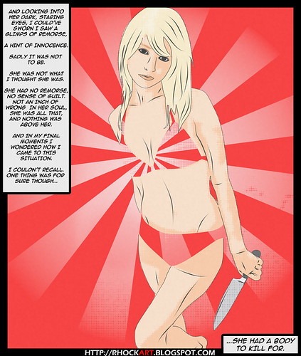
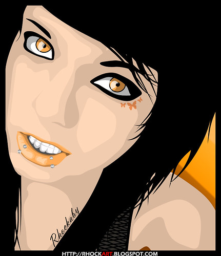
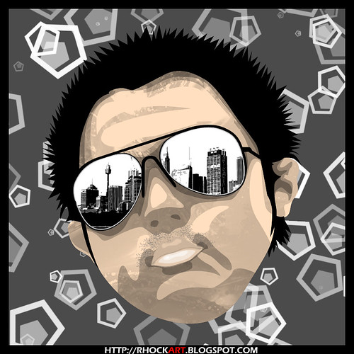
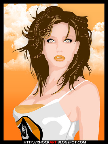
I saw this cool tutorial on how to produce retro/pop art like effects, so I decided to try it out.

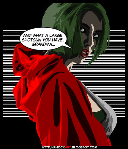
You never forget a stab to the back

The tutorial suggested that I paint the colors. Was interesting though since that was how I did most of my early work before discovering vectors. So I stuck to vectors for the colors, and some filters to add the effects.

Thursday, April 16, 2009

Pumpkin

Pumpkin

Pumpkin (14/4/09):

I never imagined her with black hair, ever. Or short hair. And never with thick emo eyeliner as well. Piercings do it for me though :)

Dream of dreaming and you'll awaken in a fantasy

Vectors except for the teasing butterflies.

lleq-ileq


Ileq-ileq (13/4/09) :

RDZ requested this for an event in Kuching. It was supposed to display a retro-like theme.

Lepak lah oh

Brushes for the background and layer properties for everything else. Font was 'Stencil'.

Zammay

Zammay

Zammay (13/4/09) :

My cousin requested this. Btw, I'm taking in requests right now. Send me a message on facebook ;)

I'm glad to see me too

Yes, that is his face. Aside from the reflection and background shapes, everything else was vectored.

Red Riding from the Hood

Red Riding From The Hood (i)

Red Riding from the Hood (13/4/09) :

Browsing through my collection, I really liked what I did with my second Rhokumaru piece, particularly the jacket. And instead of drawing my signature 6-to-4 armed rhock, I decided to go with something from the bedtime story section... with a twist of course. And no, I will not make her blond.

"...all the better to see you my dear..."

Believe it or not, it's the same babe from Cut & Scar ;) Vectors all over.

Redman Speaking

One Way Avenue

One Way Avenue (15/03/05):

It's back :)

Listen as I speak, the lies are true... I swear!

Real picture, I just messed around with filters.

Sunday, April 12, 2009

Cut & Scar

Cut & Scar

Cut & Scar (12/04/2009):

No specific reason for this one. I just wanted to sketch up a piece of a certain celebrity. Ended up having the crew's logo on her top, which I though would be nice if we ever decided to print tank tops :P

I am here, in a ghost world...

Aside from the iris and clouds, everything else was vectored. I had fun with the lips in this one :)

Thursday, April 9, 2009

F&N Roadshow


F&N Roadshow (10/4/2009):

Final poster design for the event. To those in Kuching, do show up and support you local crew! More info at:


(If the site is not up yet, try again soon!)

F&N logo's were NOWHERE to be found online, so I had to redraw them from scratch. Brushes include the skyline, rising sun, bg decor and can decor. The can was made by playing around with bevel and gradient overlays.

Fresh!

Fresh!

Fresh! (11/4/2009):

(Well I started midnight of the 10th and finished at *looks up* 6am! Fcuk me, I need some sleep). This idea just came to me a few hours ago, after finishing Soulhigher's F&N Roadshow poster. Now in my honest opinion, the soda can turned out wayyyy beyond my expectations, so might as well utilize it in a piece :) And the punch line was supposed to be different, something that went like "... better than water" if you know what I mean, b-boys :P.

Soulhigher datang lagi dengan minuman jus baru... FRESH!

Brushes were used for the can's decorations, other than that vectors all over. Towards the end (when I was getting sleepy, light-headed and trying to make casual small talk), I was just too lazy to draw the freeze. So I knicked it from a previous piece, but not to say it didn't need work, yes sir it did.

Soulhigher: Facebook

Soulhigher : Facebook

Soulhigher: Facebook (10/4/2009):

I was having a chat with Hafiy regarding the new Soulhigher group on facebook that was established earlier that day. And what better way to make our mark on facebook than to corellate both logos into one. I never knew the Eclipse emblem looked nice in blue!

It doesn't matter what you look on the outside, as long as you look good.

I just replaced colors on the layer properties from Soulhigher's trademark orange to facebook's blue. Easy ;)

E.T Farked!

E.T - BMXtreme

E.T Farked (8/4/2009):

I was watching Korea's Expression Crew's 'Wizard' performance. At the end of the routine they mimicked the E.T scene, bicycle flying with E.T in the front basket and a big moon in the background. Too bad that extreme sports weren't such a big thing for Speilberg; oh how that scene could have been so much more... face paced?

As we grow, movies change every time we re-watch them.

I borrowed the moon texture from the original poster, I wasn't keen on spending a whole lot of time figuring out how to produce a moon-like-surface on photoshop. Sparks and grass were brushes, everything else vectored.

Dekat Di hati

Dekat Di hati

Dekat Di hati (7/4/2009):

Designing for MAKE Clothing has greatly helped me improve on my designing skills, though to date some of my pieces I have yet to submit for printing since I am... how shall I put it... unsatisfied with them. So modification is the next step. The above piece WILL be submitted (sabar ah RDZ, I molah kacak2, bok submit) after more modifications that is :)

You are only separated as far as you tell yourself

The face is an original design. I've always loved designing the eyes. There's just something about gazing that appeals to me. Background was a preset brush and I used two separate fonts for my name tag and the title.